Project Overview
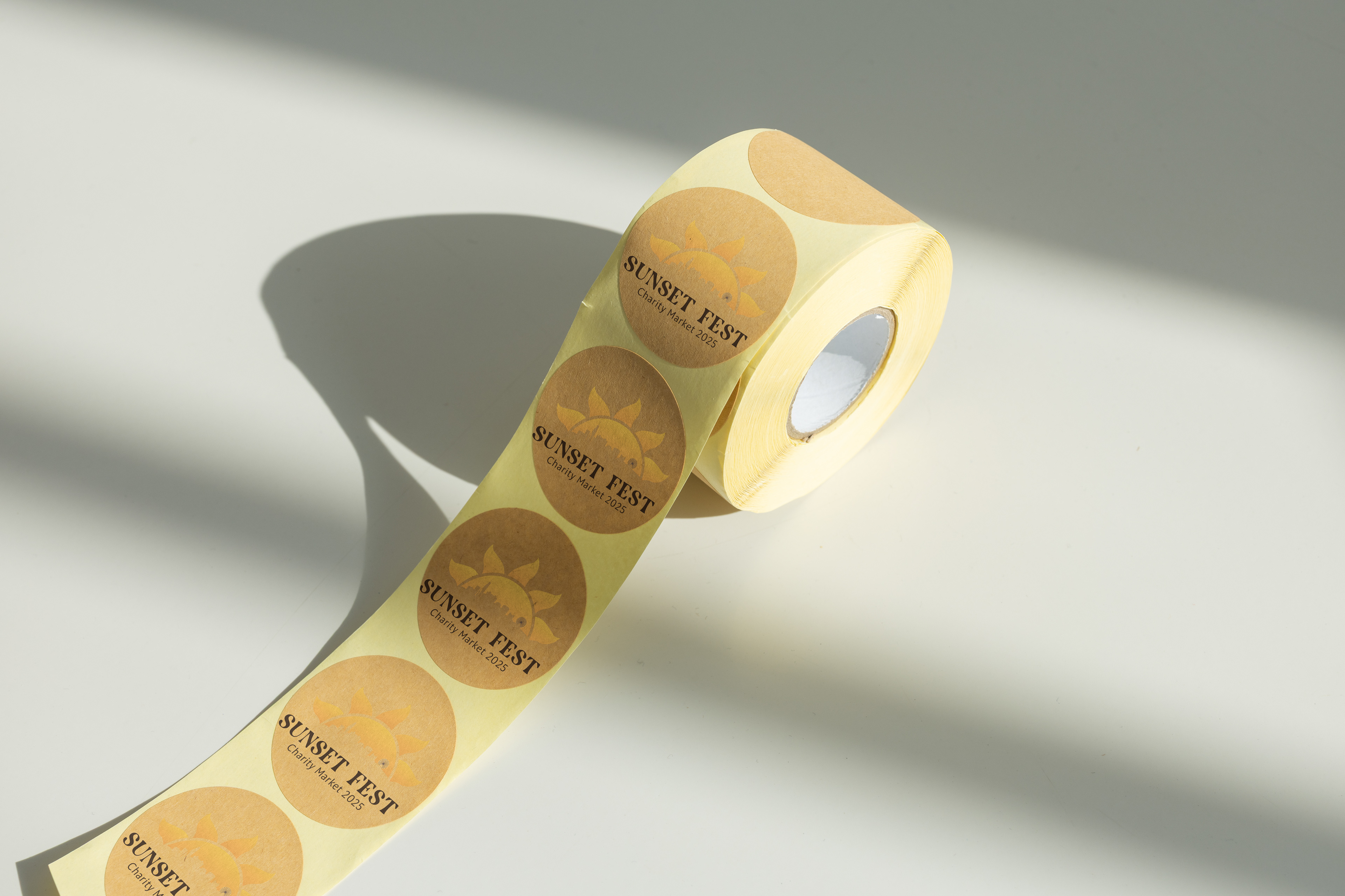
For this project, I created a full event emblem and expanded it into a small identity system with color, typography, logo variations, and merch applications. The goal was to build something clean, bold, and flexible that could actually work across real event materials.
For this project, I created a full event emblem and expanded it into a small identity system with color, typography, logo variations, and merch applications. The goal was to build something clean, bold, and flexible that could actually work across real event materials.
Creative Direction
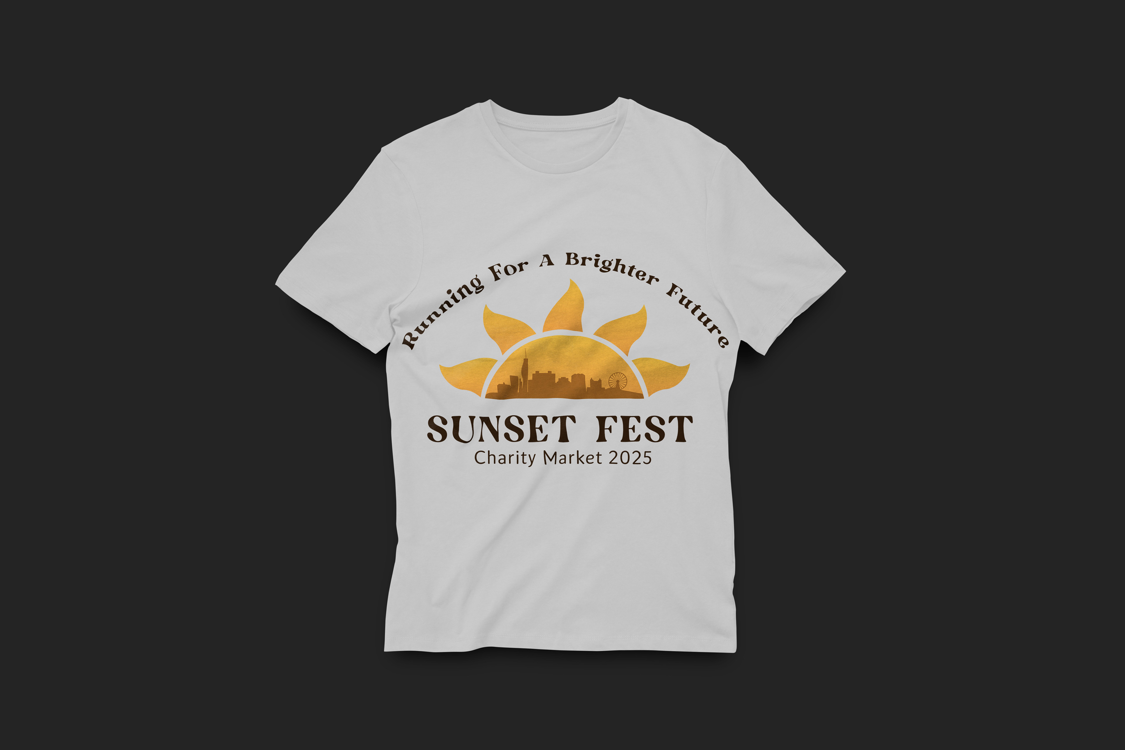
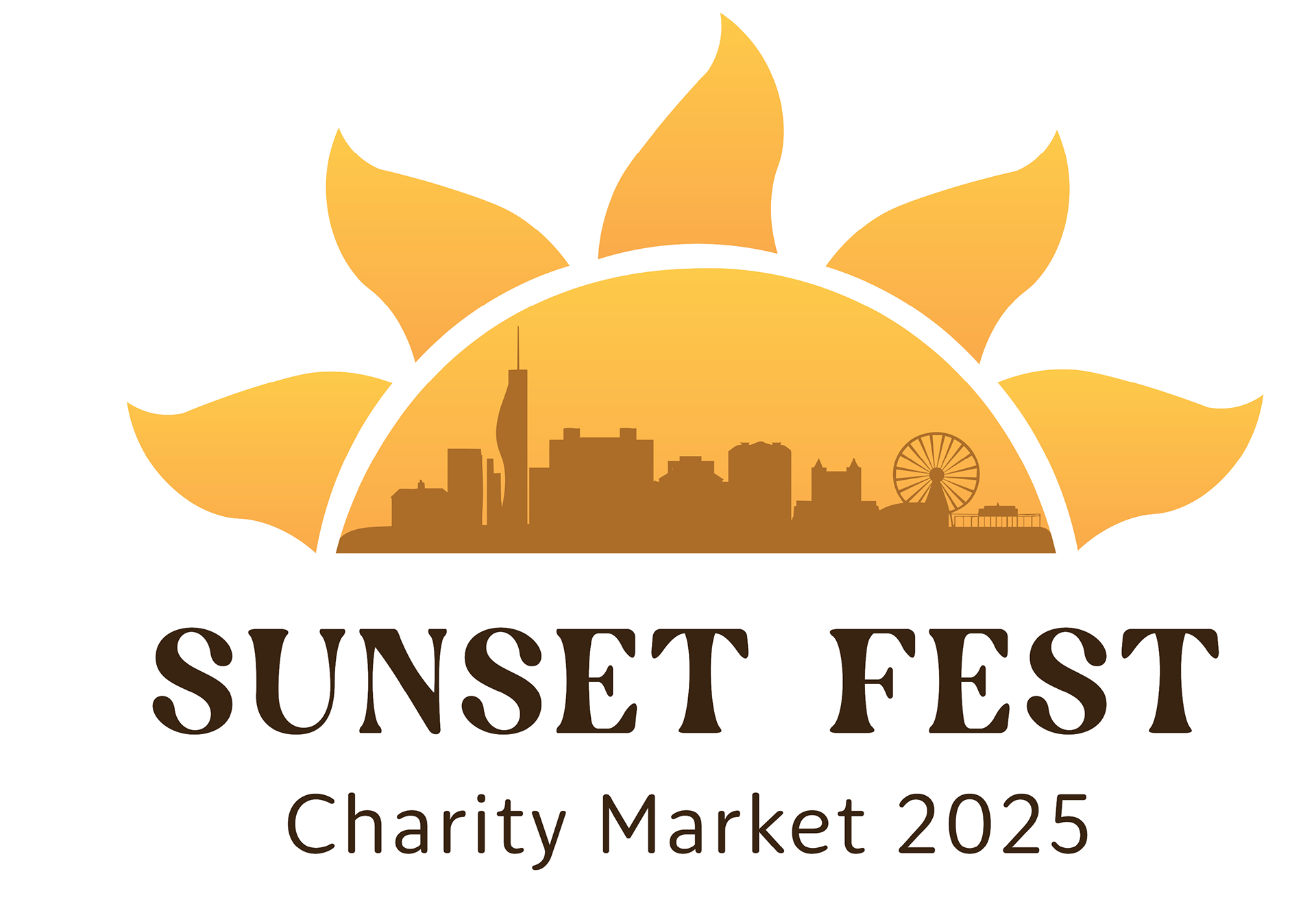
The emblem pulls inspiration from sunset gradients, simple geometric structure, and the feeling of gathering as the sun goes down. I focused on creating a clean, versatile mark that stays strong at any scale, whether it’s on a poster, badge, or festival T-shirt.
The emblem pulls inspiration from sunset gradients, simple geometric structure, and the feeling of gathering as the sun goes down. I focused on creating a clean, versatile mark that stays strong at any scale, whether it’s on a poster, badge, or festival T-shirt.
Process & Development
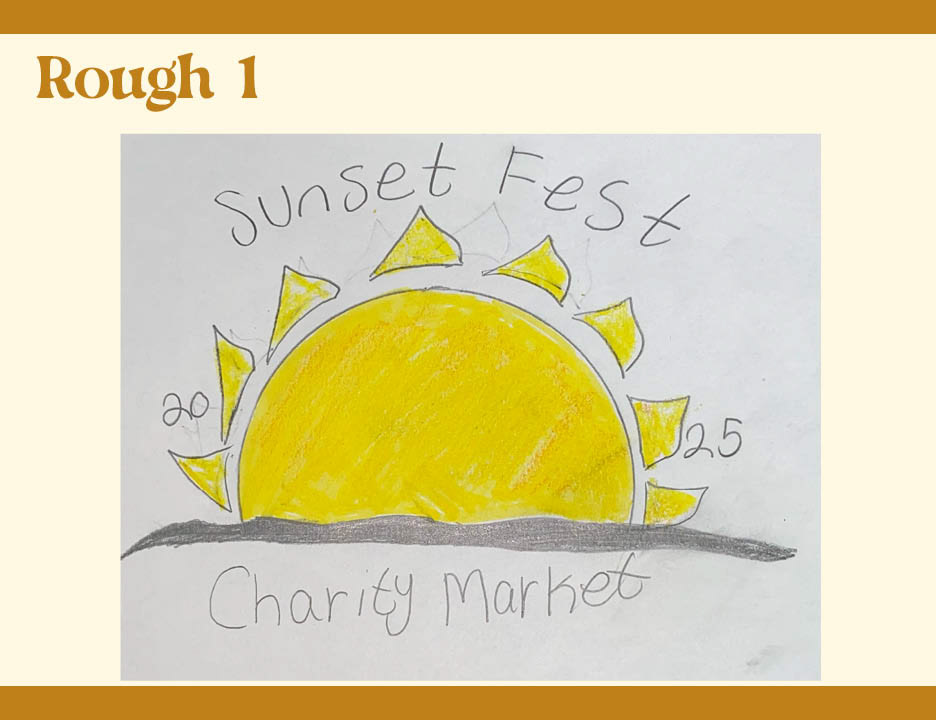
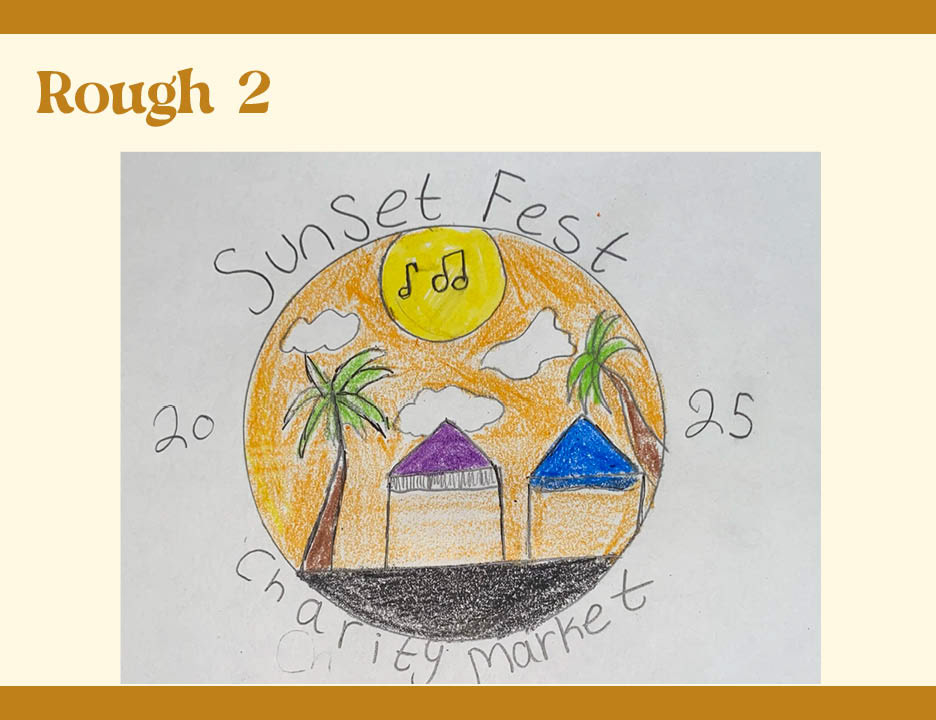
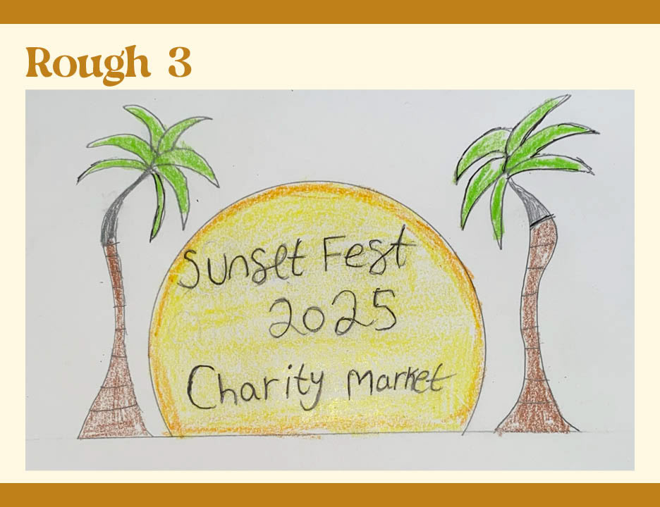
I began with visual research and rough sketches, capturing the mood of sunset lighting and festival energy. After critique, I refined the emblem’s clarity, color balance, and spacing to strengthen the overall system.
I began with visual research and rough sketches, capturing the mood of sunset lighting and festival energy. After critique, I refined the emblem’s clarity, color balance, and spacing to strengthen the overall system.
Brand Elements
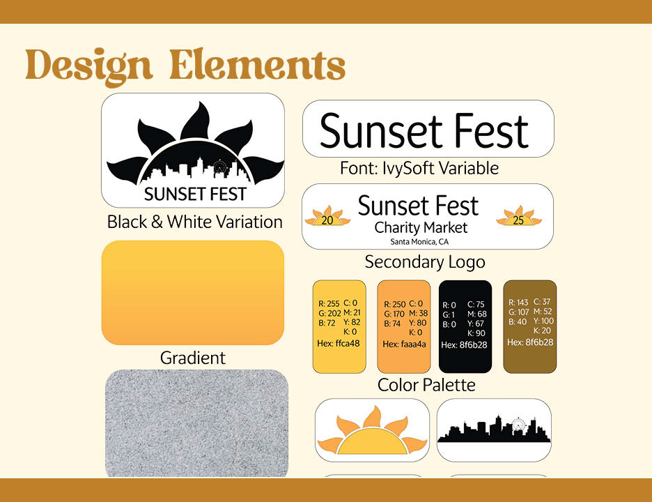
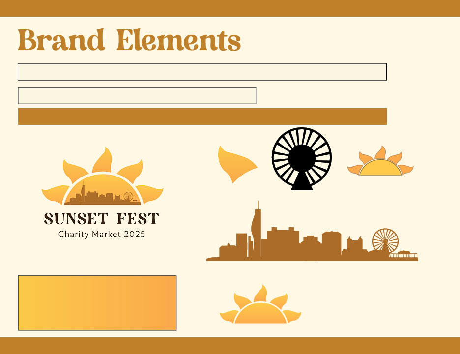
The color palette reflects the warmth and glow of a desert sunset, bold oranges, soft pinks, and grounding neutrals. Paired with clean type choices and simple supporting shapes, the system stays bright and energetic without losing clarity.
Logo Variations & Flexibility
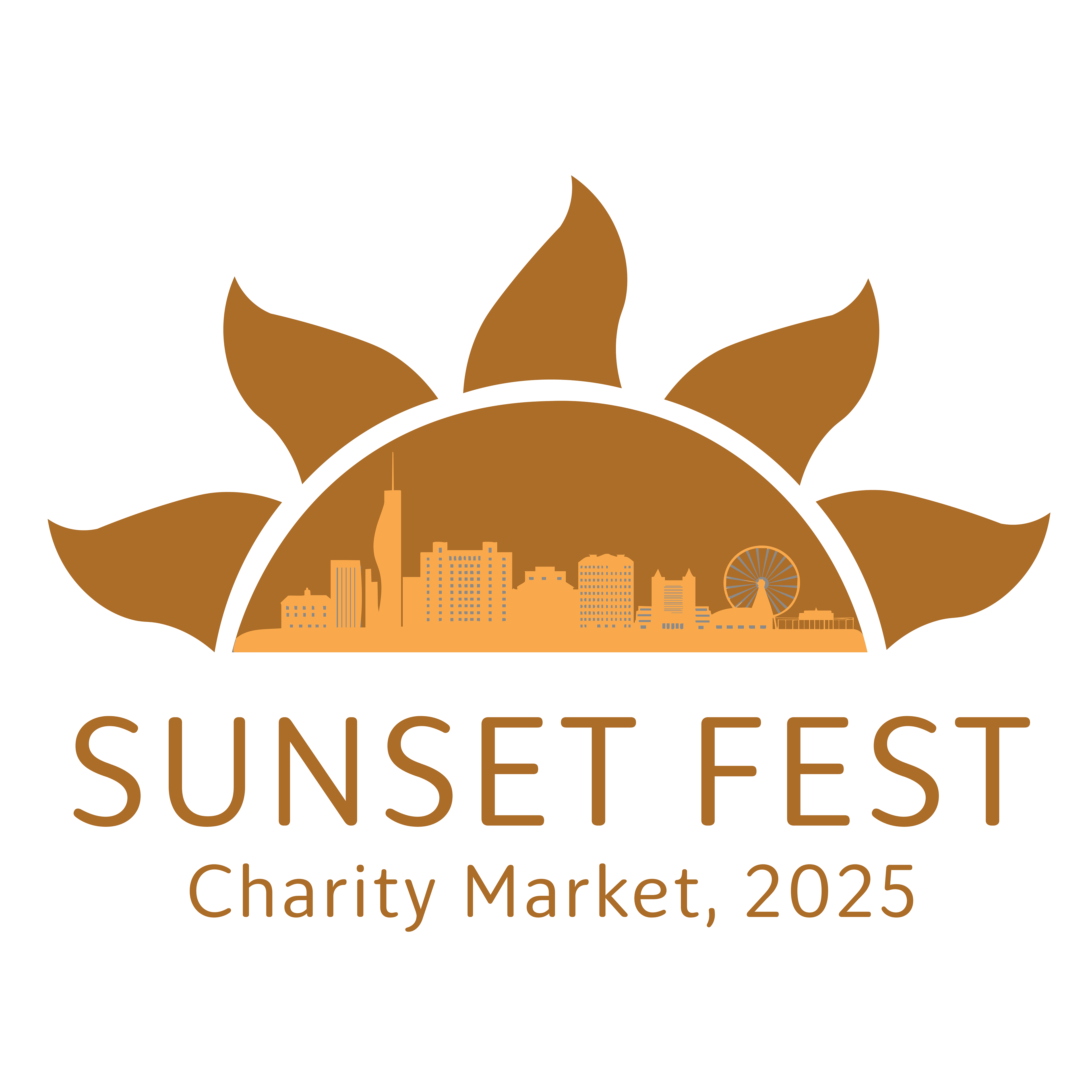
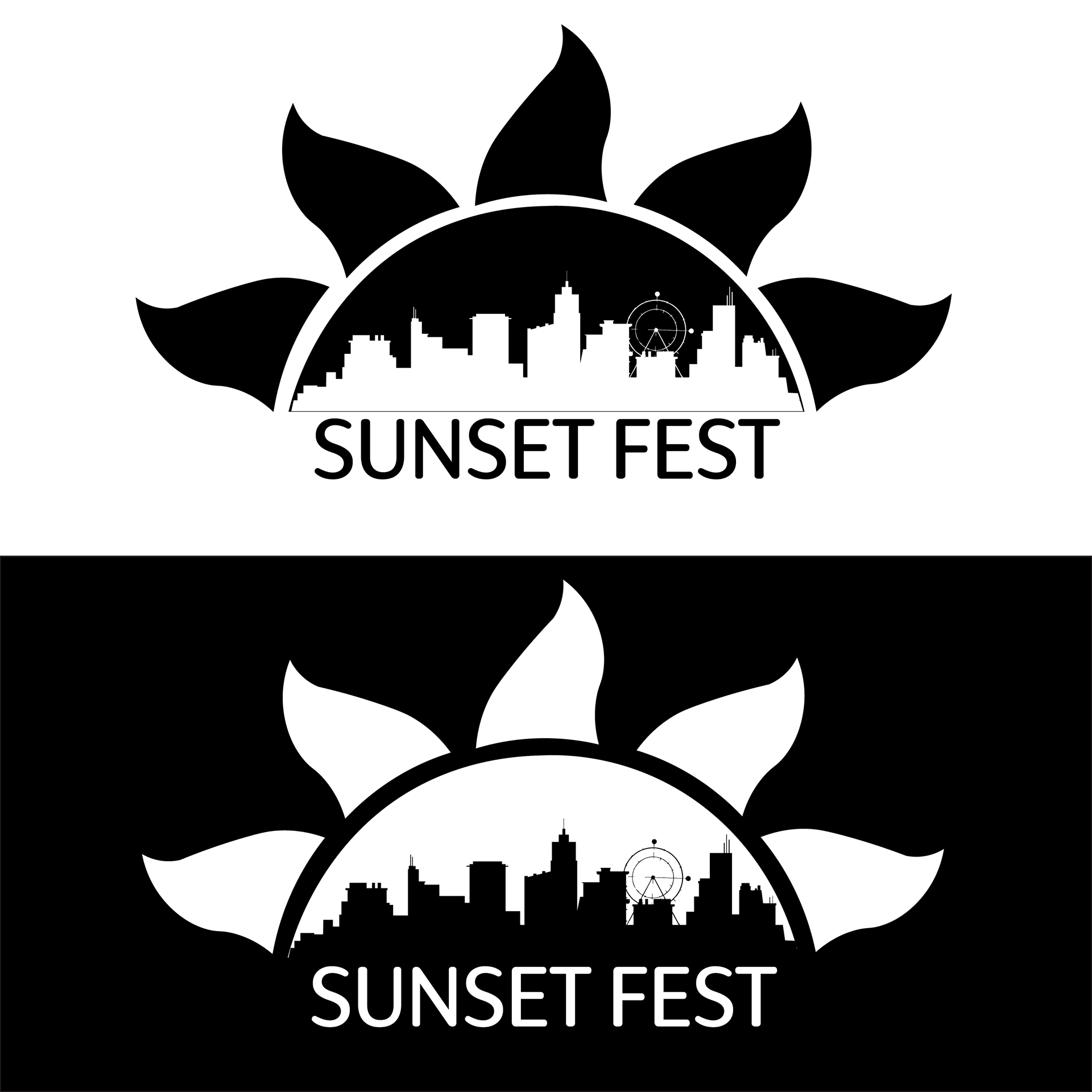
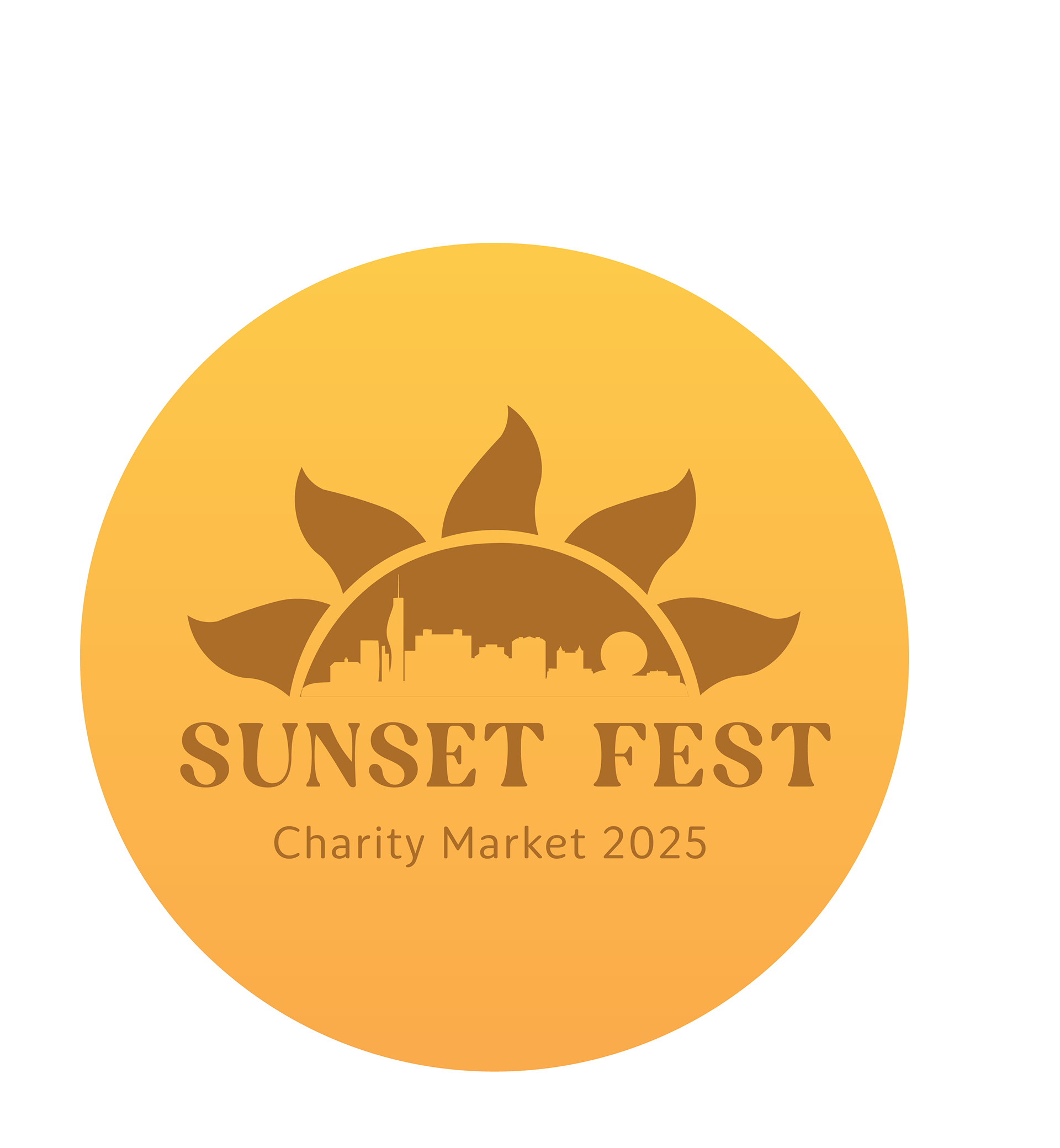
Here are the final black, white, and reverse-out versions of the Sunset Fest emblem. These variations were finished after critique to ensure the logo remains clear and impactful across different backgrounds, from social graphics to merch.
Here are the final black, white, and reverse-out versions of the Sunset Fest emblem. These variations were finished after critique to ensure the logo remains clear and impactful across different backgrounds, from social graphics to merch.
Things I Fixed:
I fixed the spacing of the flames so they aren't too close to the half circle. I also made it so the black and white are seamless. For the second variation, I reversed the colors and used the sans-serif font instead
Festival Merchandise Applications
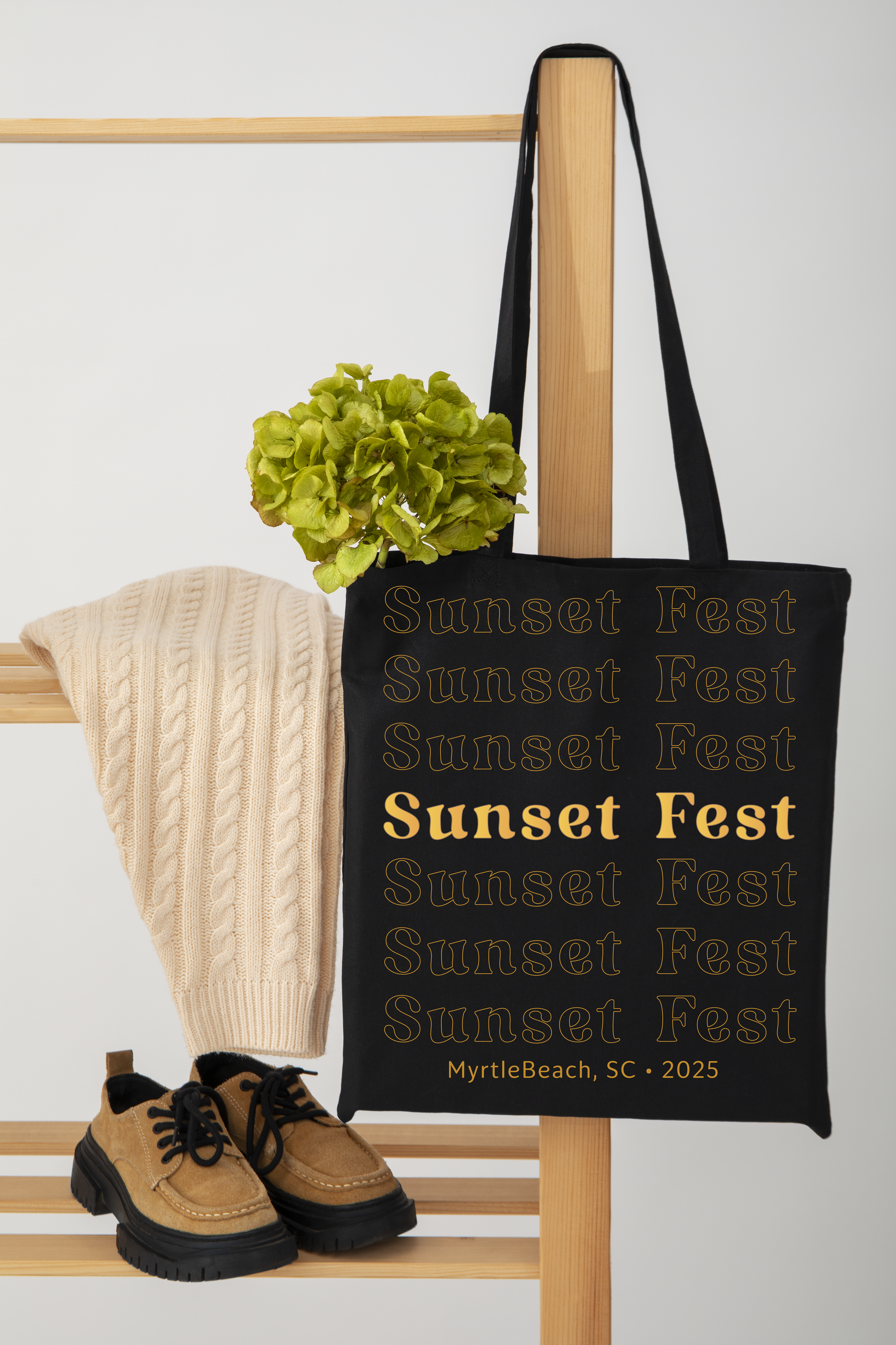
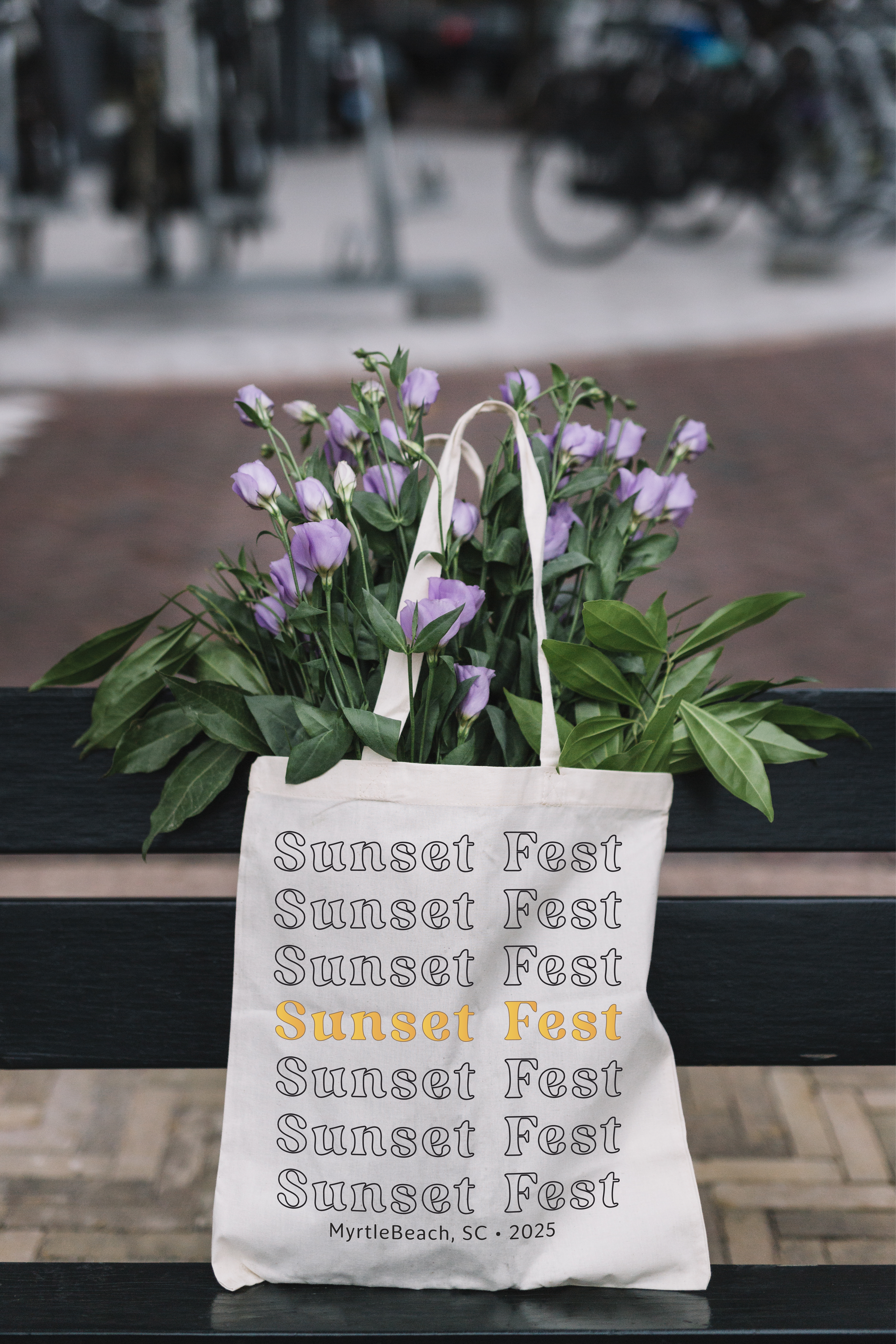
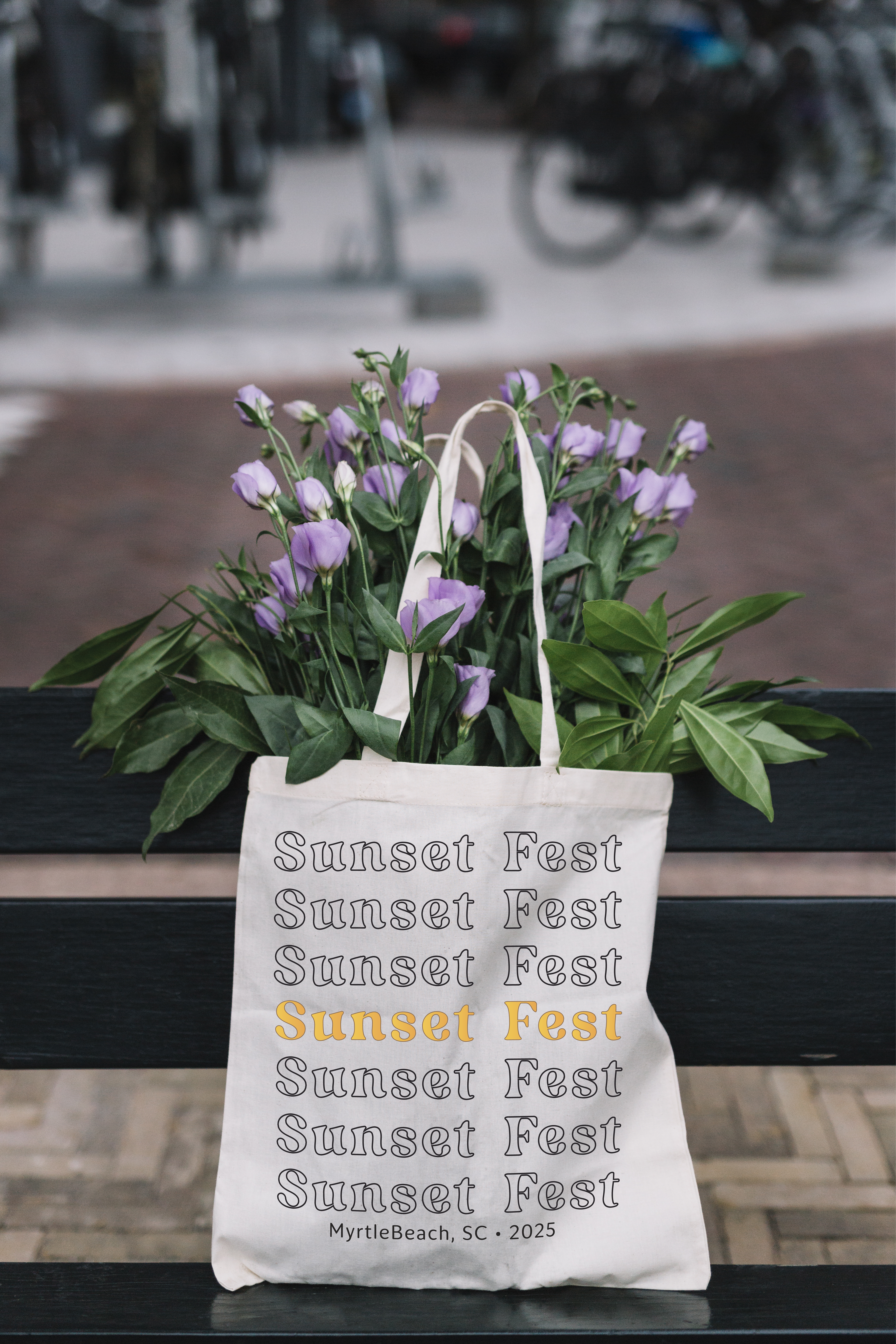
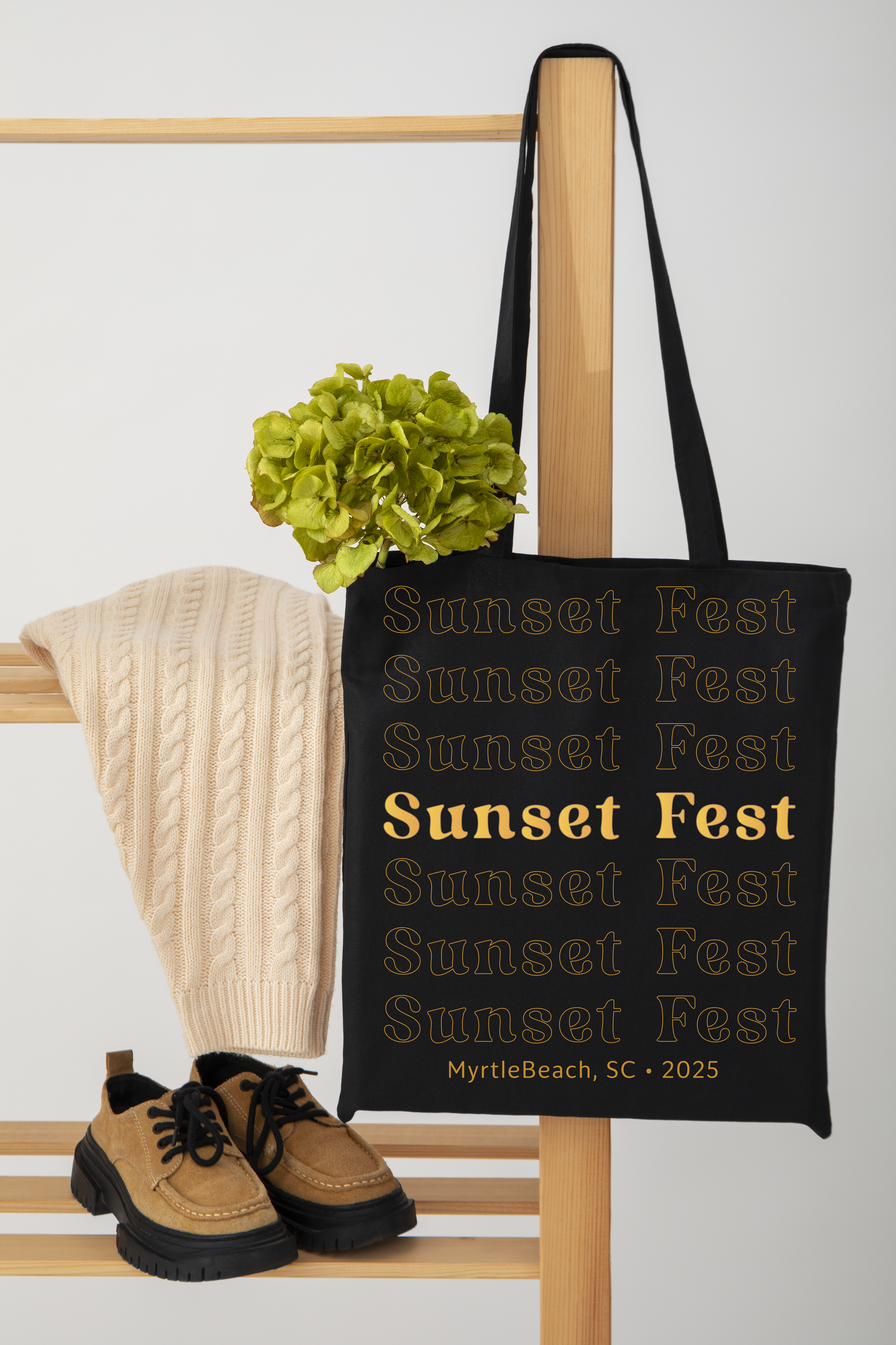
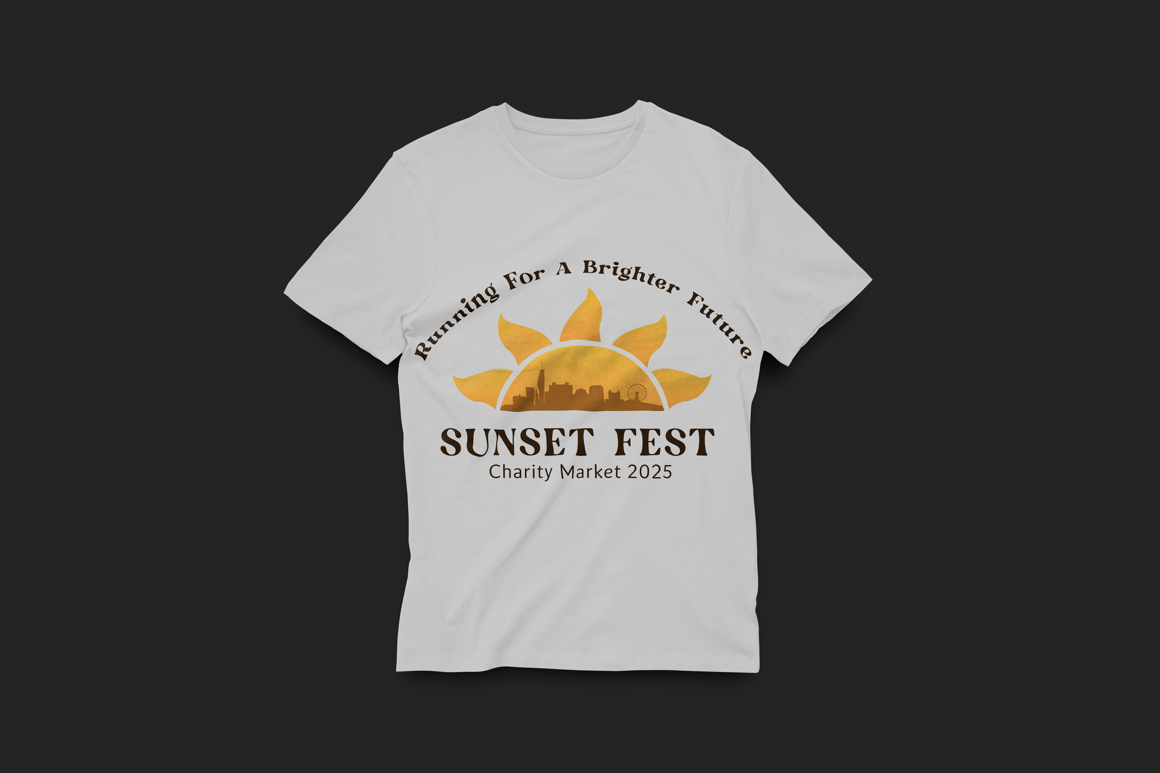
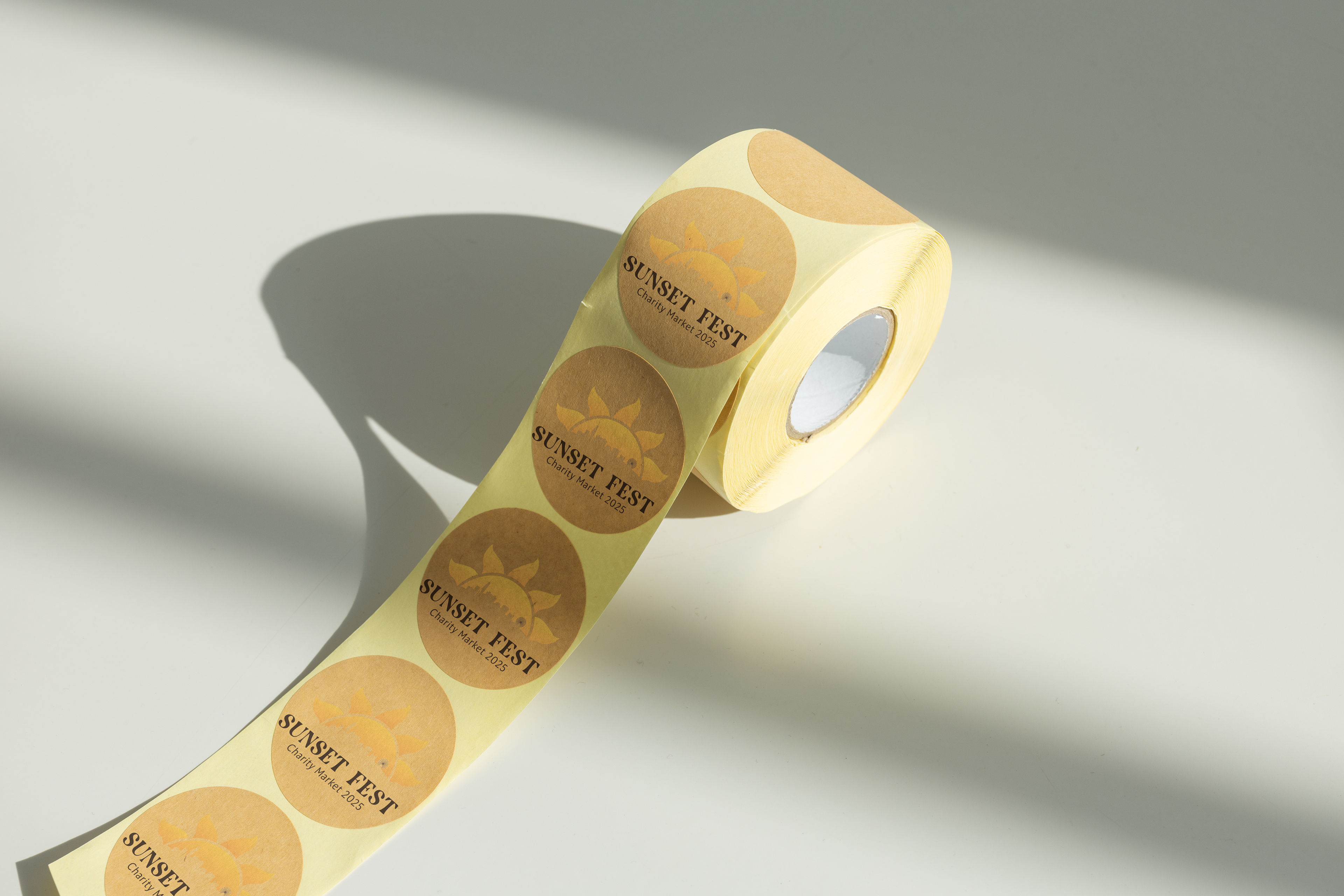
Seeing the emblem on real festival merch brings the identity to life. I applied the branding across shirts, totes, and stickers to show how the visual system extends into the full Sunset Fest
Seeing the emblem on real festival merch brings the identity to life. I applied the branding across shirts, totes, and stickers to show how the visual system extends into the full Sunset Fest
Extending the Brand
The emblem performs well across different textures and colors, keeping the Sunset Fest vibe consistent and recognizable from far away, perfect for an outdoor event environment.
The emblem performs well across different textures and colors, keeping the Sunset Fest vibe consistent and recognizable from far away, perfect for an outdoor event environment.
Final Notes
This identity system brings a warm, welcoming atmosphere to Sunset Fest. Finishing the brand elements, improving logo flexibility, and tightening the grid elevated the emblem into a cleaner, more professional final result.
This identity system brings a warm, welcoming atmosphere to Sunset Fest. Finishing the brand elements, improving logo flexibility, and tightening the grid elevated the emblem into a cleaner, more professional final result.